
Plotting sequences of discrete data
This tutorial focuses on a not very common type of plot helpful to visualize sequences of discrete data, the Stem plot. The most common data of this type are mathematical series, like sin and cosine type of sequences at distinct separates points in time, or, data from electrical discrete signals, where a signal can take values only at specific times, for example, a particular voltage that is only measured at fixed rates.
But in fact, there’s a whole other range of examples, any ranking list is sequential by nature and we can compare different values for each entity, or any index measure at particular points in time, like an economic indicator that only changes when there are market movements. Another case are outcomes of experiments that are peformed in multiple phases, like a Bernoulli random variable trial at each hour. Likewise, any sample obtained from a continuous series at uniformly spaced times, would also fit this category.
This type of plot, the stem plot, it’s very common in the Matlab community and in the Python environment as well, actually, the Matplotlib python package claims its function to be inspired by the original stem function in Matlab.
What about R?
R doesn’t come with a built-in function for this type of graph, as Matlab and Python do, but don’t be dissapointed!, with the power of ggplot we can achieve very similar stem plots in R with a little few steps, maintaining the distinctive plotting style of R.
Let’s see an example using Python
We first generate some sequence of data, and then esentially, the stem function takes the array of values of the sequence along x, and the array of values of y for the same sequence. Notice that the y values are not necessarily discrete, they can take any value.
The python’s stem function is composed esentially by 3 parts: markerlines (basically the dots), stemlines (the stems along y) and a baseline naccross x. You can then tweak each of these features aesthetics in the plot individually, such as color, size, type of line, and others classic options (as in the next example).
import matplotlib.pyplot as plt
import numpy as np

# returns 62 evenly spaced samples from 0.1 to 2*PI
x = np.linspace(0.1, 2 * np.pi, 62)

#use stem function to set the markerlines, stemlines and baseline
markerline, stemlines, baseline = plt.stem(x, np.cos(x))

# setting property of baseline
plt.setp(baseline, visible=True)
plt.show()
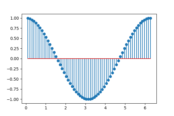
We can now see for sure, that Matplotlib developers really love Matlab’s graph style, since the plots are very much alike. So, you can easily use Python for the same goal with Matlab.
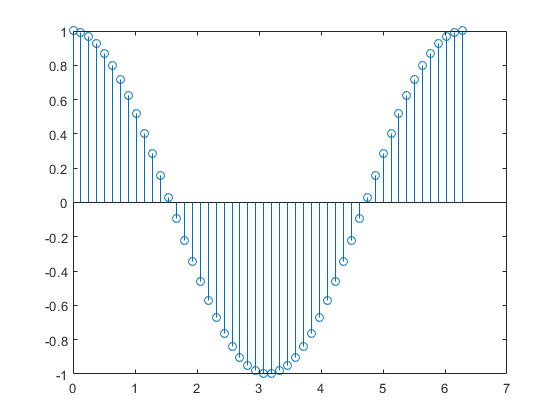
Matlab stem plot
Example using R
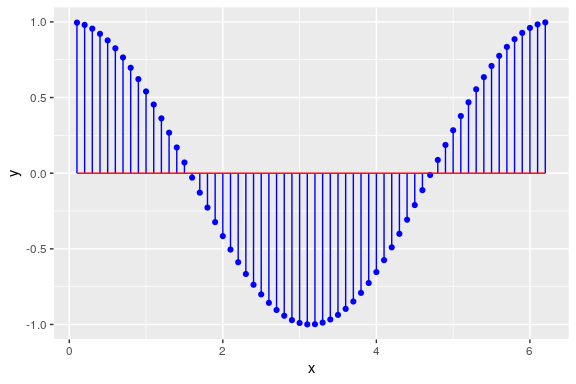
Let’s now try to plot the same sequence as a stem plot using the R library Ggplot.
As you can see in the next example, we generate some discrete sequence (x,y) and then use a combination of the functions geom_point, geom_segment and geom_line.
#generate same data
x_1 = seq(0.1, 2*pi, 0.1)
y_1 = cos(x_1)
aux1 = data.frame(x_1, y_1)

#stem plot
ggplot(aux1, aes(x=x_1, y=y_1)) +
  geom_point(color= 'blue') +
  geom_segment(aes(x=x_1, xend=x_1, y=0, yend=y_1), color='blue') +
  geom_line(aes(x_1, 0), color = 'red', size = .5) +
  xlab("x") +
  ylab("y")
As we can see from the code block, the equivalence of functions from Python to R are:
- markerline -> geom_point()
- stemline -> geom_segment()
- baseline -> geom_line()
In this case, given that we already passed the dataframe to ggplot() main function, we only need to set desired options to geom_point(). For the function geom_segment we need to set 4 arguments to the aesthetic mapping: x, xend, y and yend; basically the points in which the segments are going to be drawn. To simulate the stem plot, the key is to set the parameter x and xend to be the same, i.e., a line only of the width of x at that point, but y and yend have to be defined to go from the baseline of the data to the actual values of y (for this example all values start from 0). Finally, the baseline is simulated with the function geom_line() and its totally optional, but it relates to where the y values start accross the x-axis (in this case, at zero).
The resulting plot is impressively similar as the one made with Python.
Comparison of Python and R
Now, we are going to explore a very convenient way to compare more than one discrete sequence of the same data. When we have the same scales for the values, we can use stem plot in th same way, but here we can really see how ggplot excels in doing good plots and our lives easier!
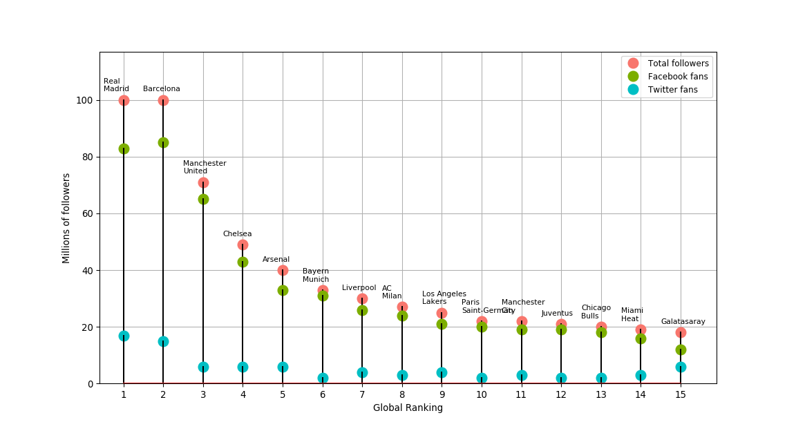
The following two code blocks plot the same discrete sequences of the fifteen most popular sports teams on Social Media in 2015 (Source: “The Real Madrid Way” by Steven G. Mandis):
Python code:
import matplotlib.pyplot as plt
import numpy as np
from mpl_toolkits.axes_grid1 import host_subplot
import mpl_toolkits.axisartist as AA

#Data sequences
globalrank = [1,2,3,4,5,6,7,8,9,10,11,12,13,14,15]
total_followers = [100,100,71,49,40,33,30,27,25,22,22,21,20,19,18]
facebook_fans = [83,85,65,43,33,31,26,24,21,20,19,19,18,16,12]
twitter_fans = [17,15,6,6,6,2,4,3,4,2,3,2,2,3,6]
team = ["Real\nMadrid", "Barcelona", "Manchester\nUnited", "Chelsea", "Arsenal", "Bayern\nMunich","Liverpool", "AC\nMilan", "Los Angeles\nLakers", "Paris\nSaint-German", "Manchester\nCity", "Juventus", "Chicago\nBulls", "Miami\nHeat", "Galatasaray"]

#Initiate plot figure
fig = plt.figure()
ax = ax = fig.add_subplot(1, 1, 1)

#generate 3 stems plots for each sequence accross the same x
markerline_1, stemlines_1, baseline_1 = ax.stem(globalrank, total_followers)
markerline_2, stemlines_2, baseline_2 = ax.stem(globalrank, facebook_fans)
markerline_3, stemlines_3, baseline_3 = ax.stem(globalrank, twitter_fans)

#stem and lines plot options
plt.setp(markerline_1, color = '#F8766D', markersize = 10, markeredgewidth=2, label='Total followers')
plt.setp(stemlines_1, color = 'black')
plt.setp(markerline_2, color = '#7CAE00', markersize = 10, markeredgewidth=2, label='Facebook fans')
plt.setp(stemlines_2, color = 'black')
plt.setp(markerline_3, color = '#00BFC4', markersize = 10, markeredgewidth=2, label='Twitter fans')
plt.setp(stemlines_3, color = 'black')

#add labels of each team
for i in zip(globalrank,total_followers,team):
  plt.text(i[0]-0.5,i[1]+3,i[2], fontsize=8)

#plot general options
plt.legend(numpoints=1, fontsize=9)
plt.axis([0.4, 15.9, 0, 117])
plt.xticks(globalrank)
plt.xlabel("Global Ranking")
plt.ylabel("Millions of followers")
plt.grid(True)
plt.show()
R code:
#Data sequences
globalrank = c(1,2,3,4,5,6,7,8,9,10,11,12,13,14,15)
Total_followers = c(100,100,71,49,40,33,30,27,25,22,22,21,20,19,18)
Facebook_fans = c(83,85,65,43,33,31,26,24,21,20,19,19,18,16,12)
Twitter_fans = c(17,15,6,6,6,2,4,3,4,2,3,2,2,3,6)
team = c("Real Madrid", "Barcelona", "Manchester United", "Chelsea", "Arsenal", "Bayern Munich","Liverpool", "AC Milan", "Los Angeles Lakers", "Paris Saint-German", "Manchester City", "Juventus", "Chicago Bulls", "Miami Heat", "Galatasaray")

#Turn sequences into dataframe
df = data.frame(globalrank, team, Total_followers, Facebook_fans, Twitter_fans)
sportsfans = gather(df, key = property, value = value, -c(globalrank,team))
sportsfans = sportsfans %>%
  mutate(property = as.factor(property)) %>%
  mutate(property = fct_relevel(property, "Total followers"))

#Combine into ggplot
ggplot(sportsfans, aes(x=globalrank, y = value)) +
  geom_point(aes(x = globalrank, y = value, fill = property), shape = 21, size = 2.3, stroke = 0.5) +
  geom_segment(aes(x = globalrank, xend = globalrank, y = value, yend = value-value), color='black', size= 0.5, alpha = 0.5) +
  scale_x_continuous(breaks = seq(1,15,1), sec.axis = dup_axis(name = "Team", labels = team)) +
  theme(axis.text.x.top = element_text(angle = 45, hjust = 0), legend.title=element_blank()) +
  xlab("Global Ranking") +
  ylab("Millions of followers")
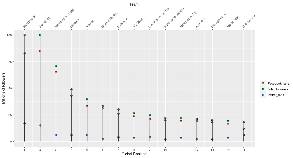
As seen above, we can practically achieve the same plots using the mentioned functions in each language by making little changes to the options in each one.
Here, we should focus on the differences between the 2 languages. It easy to see that when turning to R we can make use of the functionality of the dataframes in conjuction to ggplot. Once the 3 sequences are combined into one long dataframe (using the gather function), it’s rather effortless to pass it to ggplot and plot all the sequences at once and changing options such as colors, according to each sequence value set as factors (in this example the variable “property”).
In comparison, we can see that for Python to plot the 3 sequences into one plot, we need to specify each tuple of (markerlines, stemlines, baseline) for each sequence, and then adjust options, such as color, for each sequence as well. This can turn into a rather boresome task and longer code.
Additionaly, as you can imagine, once you learn to use ggplot it becomes a matter of seconds to add and adjust plot options. In this case, in the R plot I was able to add a second x-axis on the top with the option “sec.axis = dup_axis()” and specify the names of each team on the ranking. In contrast, it’s a rather time-consuming task to figure out in Matplotlib how to set this labels as a second x-axis on the top to adjust properly (I had to use the function plt.text() as a proxy and it doesn’t even look that nice). It’s on these little things where Ggplot takes the lead, and why you should consider R even when it doesn’t have all the existing functions out there.