
In this post, I want to show how easy and quick you can explore your data and look for insights using Tableau.
This time, I will be using review data from a very popular language learning app called Memrise from the Google Play Store. Reviews are one of the most relevant pieces of information when attracting more users, so I thought it was worth looking at this data in more depth.
I collected the dataset using the open-source API, Google-Play-Scraper using Python:
import json
from google_play_scraper import app, reviews_all

result = app('com.memrise.android.memrisecompanion')

with open('./memrise_basic.json', 'w', encoding='utf-8') as f:
	json.dump(result, f, indent=4)


reviews_list_en = reviews_all('com.memrise.android.memrisecompanion', sleep_milliseconds=100, language='en')

with open('./memrise_reviews_en.json', 'w', encoding='utf-8') as w:
	json.dump(reviews_list_en, w, indent=4)
I decided to do this for the list of languages available in the app, which you can do by simply changing the language parameter as shown above (English). With a json file for every language, I decided next to structure all reviews into a Pandas dataframe:
langs = {'en':'english','es':'spanish','fr':'french','de':'german','ja':'japanese','it':'italian','ko':'korean',\
		'zh':'chinese','pt':'portuguese','ru':'russian','ar':'arabic','nl':'dutch','sv':'swedish','no':'norwegian',\
		'pl':'polish','tr': 'turkish', 'da':'danish'}

data = []
for key, value in files_name.items(): #read json files into files_names dictionary
  df_aux = pd.read_json(key, orient='records')
  df_aux['language'] = langs[key[16:18]]
  print(df_aux.shape[0])
  aux_list = df_aux.values.tolist()
  data.extend(aux_list)


df_raw = pd.DataFrame(data,columns=['reviewId','userName','userImage','content','score','thumbsUpCount','reviewCreatedVersion','at','replyContent','repliedAt','language'])


df = df_raw.drop(['userName','userImage','reviewCreatedVersion','replyContent','repliedAt'], axis=1)

df = df.rename(columns={'reviewId':'review_id','userName':'user_name', 'thumbsUpCount':'thumbsup_count', 'at':'timestamp'})

df['total_words'] = df['content'].str.split().str.len()

df = df.drop(['content'], axis=1)
After a couple of adjustments like dropping columns I won’t use, renaming some of them, and creating a new column, I ended up with the following DataFrame:
| review_id | score | thumbsup_count | timestamp | language | total_words | |
|---|---|---|---|---|---|---|
| 0 | gp:AOqpTOHamIweFSBCS7OWLBfdyWjz3WgGmb0n8-MEeo5... | 2 | 0 | 2021-05-19 15:44:07 | english | 16.0 |
| 1 | gp:AOqpTOGI8LwkPYOi1l8BX2GJAEx-FKWmnVb1NK2UrAE... | 5 | 0 | 2021-05-19 15:16:39 | english | 1.0 |
| 2 | gp:AOqpTOHCthAjKSUTaGwEOycjfNY61otauSj_6kDwxhy... | 4 | 0 | 2021-05-19 14:49:37 | english | 12.0 |
| 3 | gp:AOqpTOEibnCpS70HfqEt0wqObDehV1GrFzQeKw9Jbtp... | 5 | 0 | 2021-05-19 14:44:03 | english | 4.0 |
| 4 | gp:AOqpTOFidYL61WOS0IsVF3tdBe2Of6Q28oEZfowTAJH... | 5 | 0 | 2021-05-19 14:28:16 | english | 15.0 |
| 5 | gp:AOqpTOGuXG3mnaWJ4Uj96R5hpCsWz-YGSkZ1Dd9xgLf... | 4 | 0 | 2021-05-19 12:41:31 | english | 9.0 |
| 6 | gp:AOqpTOEp_tmeJqpXiVjsSEeqc6IUNV8btLarVNESB04... | 5 | 0 | 2021-05-19 12:23:26 | english | 2.0 |
| 7 | gp:AOqpTOGZB1cGF07pZ8A6Gzr_RARdP4-BwljmaTnEDXi... | 5 | 0 | 2021-05-19 12:16:25 | english | 2.0 |
| 8 | gp:AOqpTOFjeVT0CnGViQUSEWLYkugC7Wyyh03CnIZxMqR... | 4 | 0 | 2021-05-19 11:06:25 | english | 3.0 |
| 9 | gp:AOqpTOHkCP3JjEm3V7FQ_JQQ9fCbOVLCORMBloB2aHq... | 5 | 0 | 2021-05-19 09:19:35 | english | 38.0 |
| ... | ... | ... | ... | ... | ... | ... |
df.to_csv('memrise_df_languages.csv', index=False)
The resulting CSV file has 509,904 reviews…not bad! I decided to leave out the content of each review for now (I don’t intend to do text analysis here) and use the count of words of each review instead, maybe there’s some interesting there.
Now that I’m done with the collection and processing part we can load the data into Tableau and start exploring!
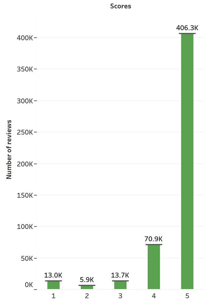
First, let’s confirm what the Google Play Store tells us about the number of reviews per score for this app. By looking at the following histogram, it’s clear that the collected data follows the same J-shaped distribution:
Now, let’s see the number of reviews per language:
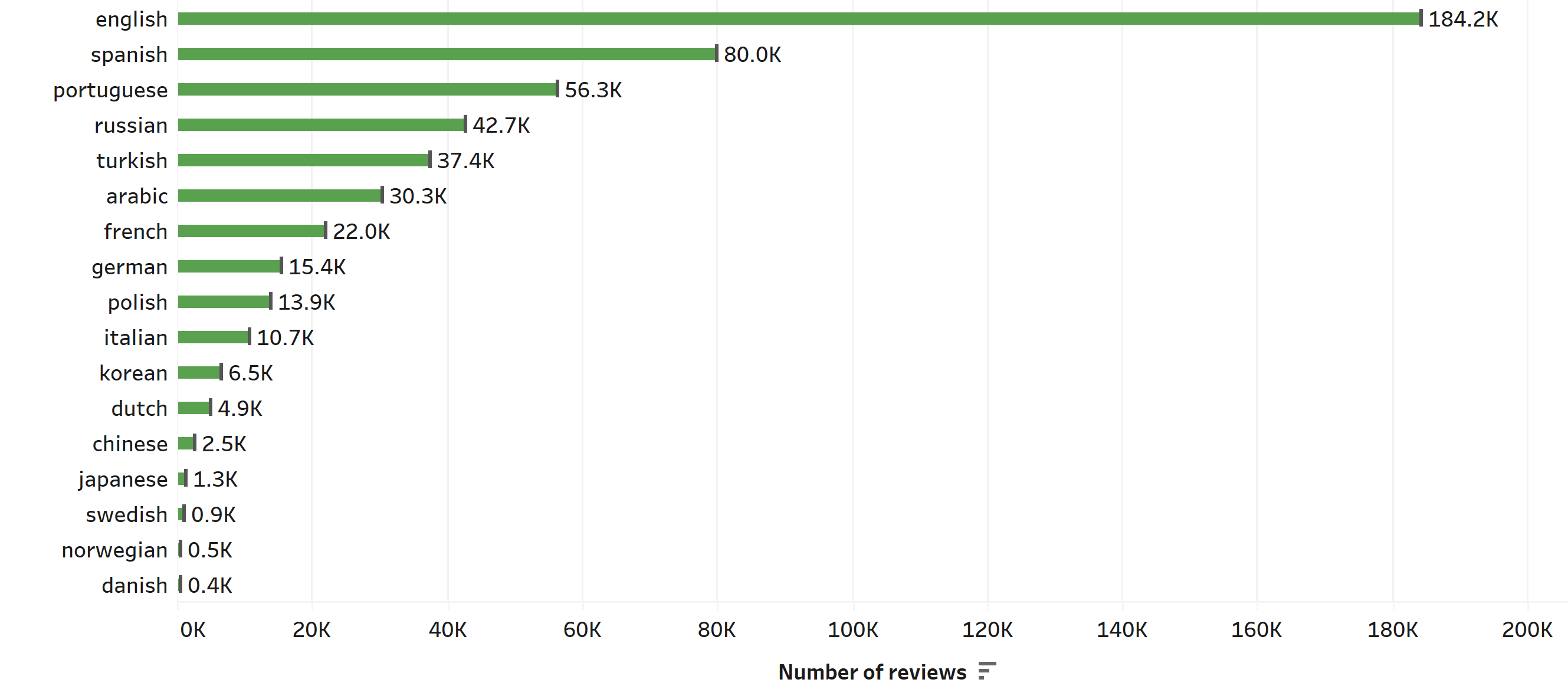
We can see that reviews written in English surpass by far the number of reviews of any other language, and it is almost the same amount as the 3 following languages: Spanish, Portuguese and Russian. Also, it’s worth noting that the review system of the app is not doing so well for north-European languages such as Swedish, Norwegian, and Danish.
Now, I’m wondering how the number of reviews has evolved over time, and whether there is any sign of trends going on.
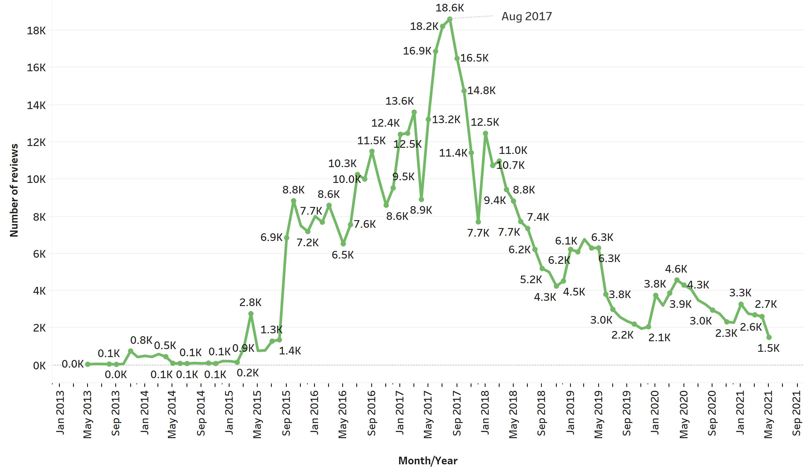
The plot above tells us that the peak in the number of reviews occurred in August 2017, and it suggests that overall 2017 has been the year with more ratings for the app. The Memrise app was launched in September 2010 but probably was available at the Google Play Store a bit later. You can see a very low growth at the beginning of the graph during 2013-2015 and it’s around the end of 2015 and the beginning of 2016 where the company started to get much more user interaction through ratings. Then, after 2017 the number of ratings has been in steady decline from that August 2017 peak, with some minor peaks during mostly winter times.
There is no clear evidence of any seasonal behaviour of users, meaning you can’t predict when users are most likely to review the app. Nevertheless, there is a clear upwards tendency during the first years and a clear downward tendency in most recent years. Interestingly enough, I thought there would be a major increase in reviews during the first months of the pandemic, around March-April 2020, but it doesn’t appear to be the case (reviews don’t necessarily translate into more app usage).
Next, I was curious about the growth in the number of reviews across the years by language. The following plot shows the fraction of the total number of reviews of each language during each year:
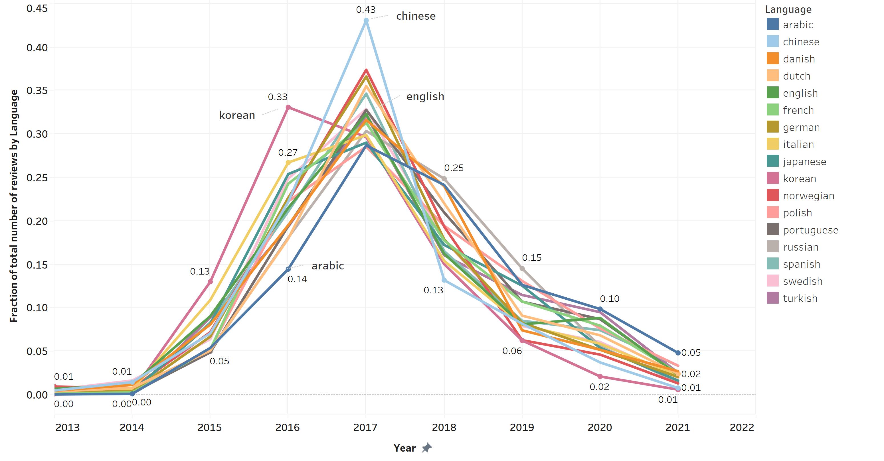
It is particularly hard to see individual growth, but it is possible to see that in 2016, reviews in Korean represent 33% of its total, while 43% of reviews in Chinese were made in 2017, which we known by the plot above, was the year with the highest peak in reviews. In contrast, we can see that for Arabic, a smaller proportion of its total reviews were made during earlier years, and a bigger number of reviews were made later after the 2017 peak.
A nice feature of Tableau is the highlighter option, which lets you see a particular value shading the rest of them. I wanted to highlight the fraction of the total reviews in English, since they represent the majority of reviews:
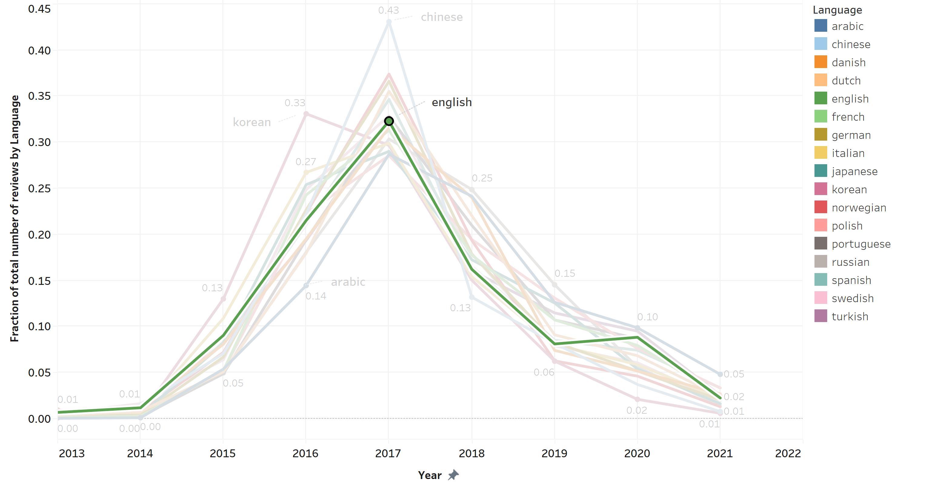
And, what we can observe here, is that reviews in English follow the same pattern as the rest of the languages, having no particular increase or decrease out of the normal growth in each year.
To follow this idea, I wanted to plot the cumulative growth in number of reviews per language across years:
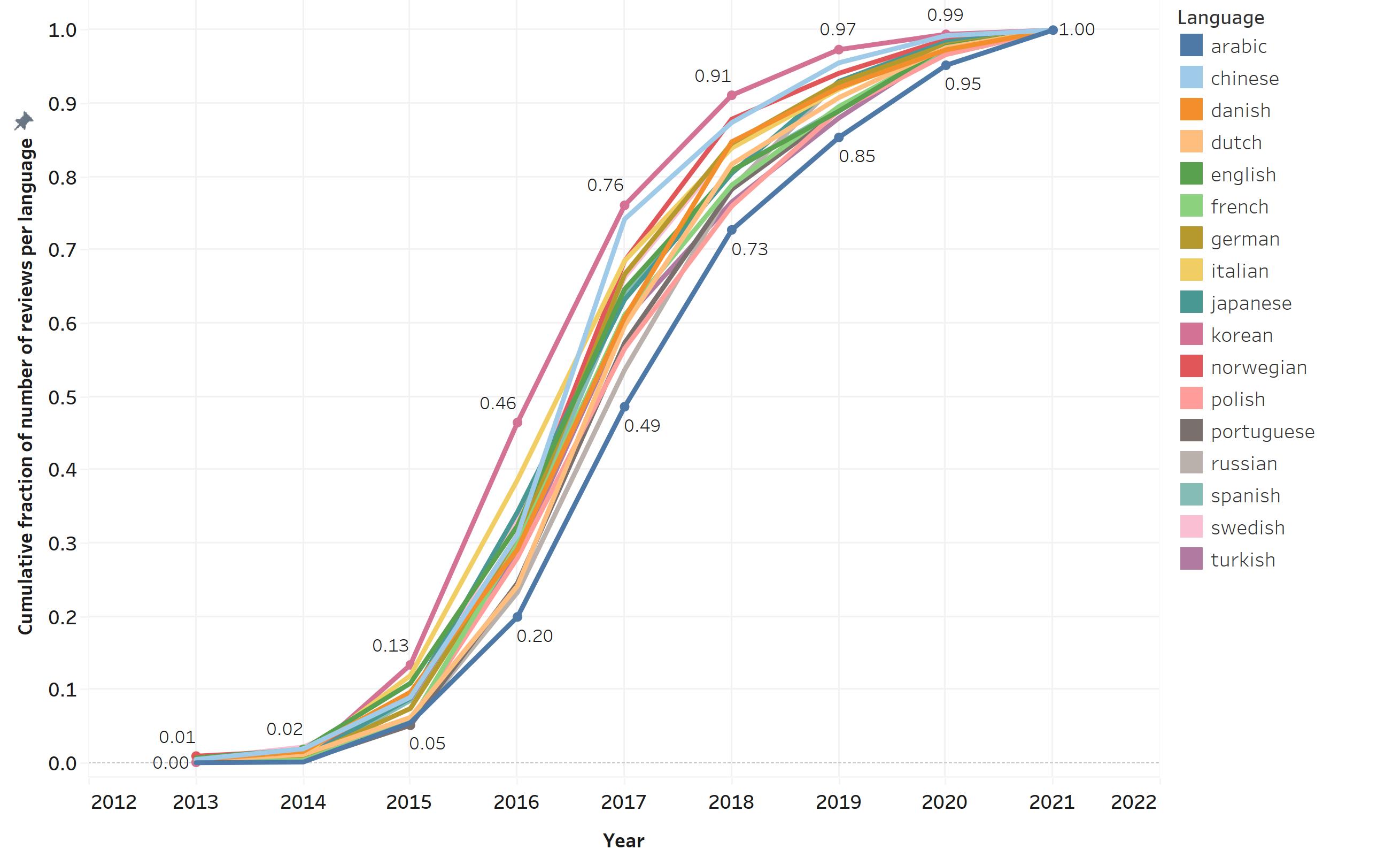
This plot confirms that the number of reviews in Japanese was the one that grew earlier and reviews in Arabic were the ones that grew slower. The difference in this rate of growth is most notably in 2017, when Japanese reviews already accounted for more than 76% of reviews, while by the same time, reviews in Arabic only accounted for 49% of its total reviews.
And last but not least, as I mentioned above, I calculated the count of words each review has, for people that write content along with the score. I was interested if there was any difference in the number of words a person leaving a review uses in each different language. And this is a tricky one because the difference can be confounded among many things including differences in the alphabet, to length of sentences, to how much a language uses concepts, like kanjis, instead of words.
So, having this in mind, I plotted the standard deviation in the number of words per language:
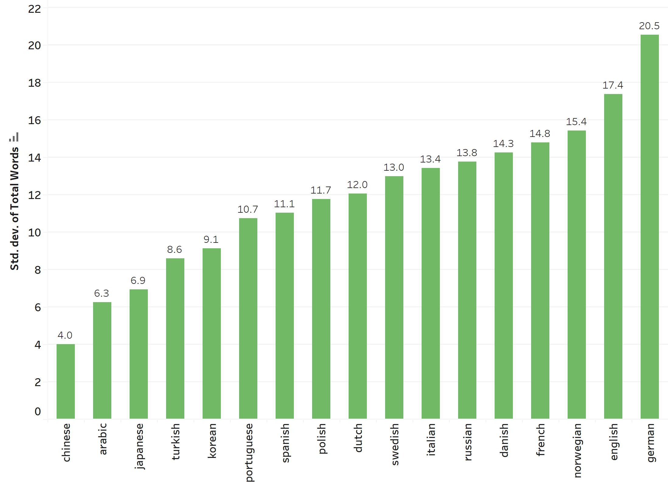
And, not surprisingly, languages that use kanjis have a lower standard deviation than western languages, and languages that are very similar and have a common root appear together, like Spanish and Portuguese, or Dutch and Swedish, or English and German. What the standard deviation tells us is the number of words in each language the reviews tend to deviate from the average amount of words for the same language.
It’s easy to see that with a couple of plots quickly made on Tableau, you can rapidly get to know more about the data and see if there’s anything worth exploring in more depth before doing any more complex models or analysis.